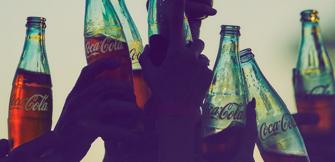
Exploring the Iconic Brand Design Behind the Coca‑Cola Red Disc
11-03-2017
From its symbolic Coca‑Cola text, what we call Spencerian script, to the unmistakable contour bottle, Coca‑Cola has worked for more than 130 years to create its iconic brand designs.
But in all the innovation and creativity there’s been one symbol that keeps quietly making itself known: the red disc.

Since it was first hand-painted in the 1930s, the red disc or “button” sign has been used to advertise Coca‑Cola.
The image fast became a cornerstone outside corner stores and milk bars and it became an emblem of integrity. Used to single out where real Coca‑Cola could be purchased, the red disc was purified and systemised by D’Arcy Advertising creative director Archie Lee in 1947.

In February 2017 Coca‑Cola unveiled new packaging in Australia that unites all the Coke varieties including Coca‑Cola, Diet Coke and Coca‑Cola No Sugar under a single visual identity anchored by the iconic Coca‑Cola red disc.
James Sommerville explores the Coca‑Cola design legacy
“By applying the disc across the Coca‑Cola trademark we’re using a signature asset in a contemporary and surprising way to share the equity of Coca‑Cola across all products,” said James Sommerville, global vice president of design at Coca‑Cola.
“Although the red disc is not always presented in the same way whether it’s on the bottle or in a TV ad, the result is a consistent brand signature that refreshes our familiar red disc icon yet applies it in a systematic and modern way,” he said.
For James, the disc is all about capturing the love our customers have for the original Coca‑Cola red. “We’re using the red disc as a graphic device to really represent all Coca‑Colas,” he said.
How did red become so synonymous with Coca‑Cola?

“The red disc was on stores, on the boardwalk … it was a beacon, a trust mark that said to the passerby, ‘you will get a real Coca‑Cola here in this store’, and that was in the 1940s and 50s. We’re using it today in exactly the same way.
“When you see that disc on a can you know you’re buying a real Coca‑Cola. We’re taking a page out of the playbook of the 1940s but using it in a more contemporary way around packaging, not just physical signage,” he said.
Read Time
What others are reading
More to enjoy