Trace the 130-year Evolution of the Coca‑Cola logo
04-04-2018
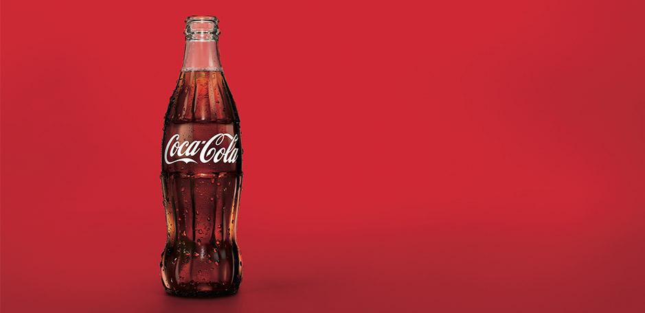
The Coca‑Cola logo is iconic for being universally recognisable. However, you may be surprised to know the brand’s world-famous script and wave haven’t always looked exactly as they do now.
This timeline explains some of the changes we’ve seen to the drinks design since the first-ever Coca‑Cola was poured over 130 years ago.
1886 – What’s in a name?
On 8 May 1886, Dr John S Pemberton nailed the formula, but it was his bookkeeper who came up with the name "Coca‑Cola®". Frank M Robinson, suggested that “the two Cs would look well in advertising”.
And with that, Robinson also designed the now world famous Coca‑Cola script logo.
He wanted his name for the new product to have an effective and dramatic style of its own. He experimented with an elaborate Spencerian script, a form of penmanship characteristic of that time. After consultation, the others working at Pemberton’s company adopted the script by unanimous consent.
Drawn in flowing handwriting, Robinson’s elaborate script was very “of the moment”, and it remains one of the most recognisable trademarks in the world.
Instead of seeing different packaging for Coca‑Cola Classic, Diet Coke and Coke No Sugar, the flavours were all united under the classic Red Disc logo design.
The latest iteration of the Coca‑Cola logo design aims to highlight that all flavours are part of the Coca‑Cola family.
Want to know more?
Try this: Coca‑Cola Slogans through the Years and How well do you know your favourite Coke?
Read Time
What others are reading
More to enjoy
