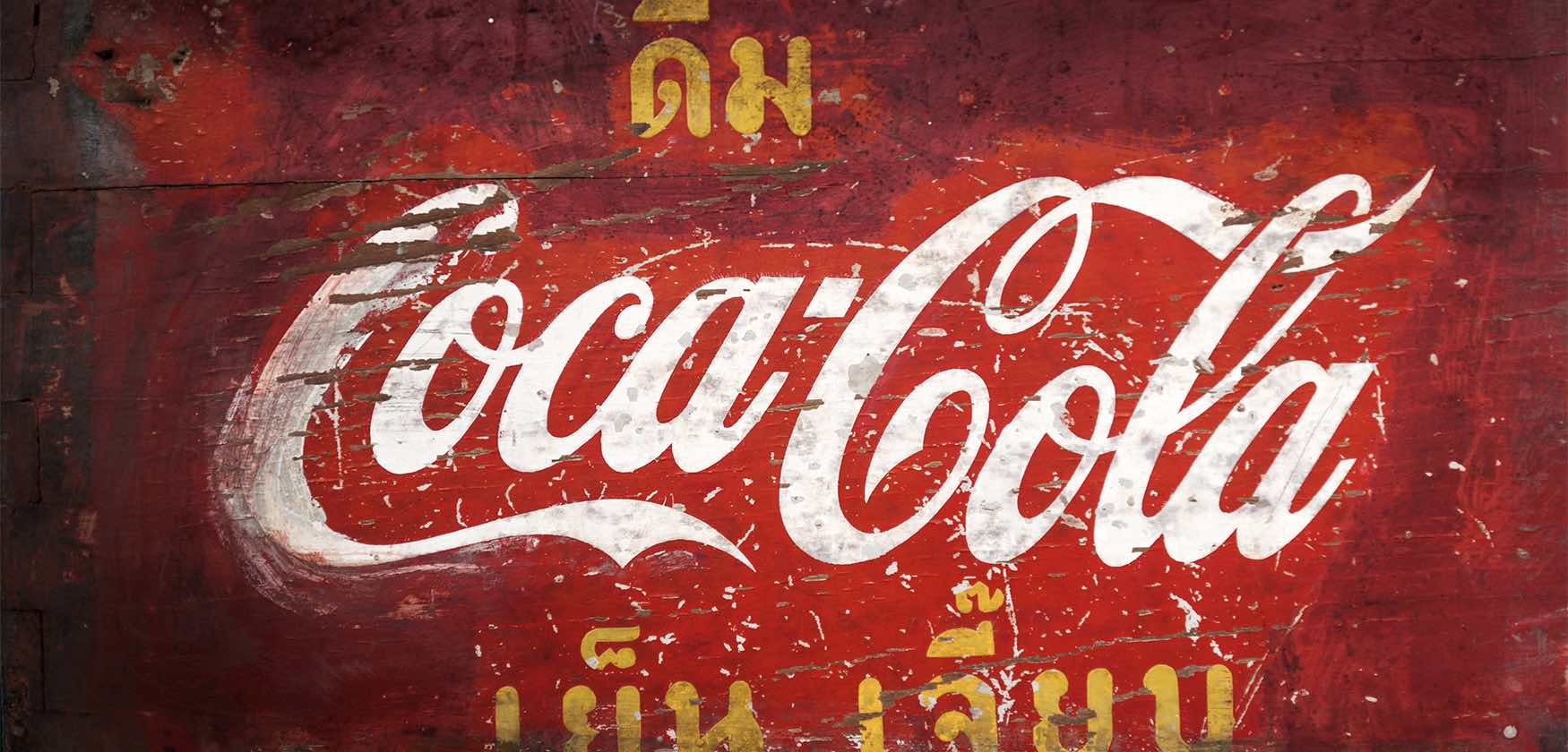
The Coca‑Cola logo story
Get to know the changing face of the Coca‑Cola logo, from inception to present day.
We all know the Coca‑Cola logo when we see it. But the changes this logo has seen! Oh, if logos could talk. It hasn’t always looked exactly as it does now, as this timeline explains...
1886 – What’s in a name?
John S Pemberton finalises the formula for his new drink, and his partner, Frank M Robinson, suggests the name Coca‑Cola, believing that “the two Cs would look well in advertising”. He experiments with writing the company’s name in Spencerian script – a popular writing style back then.
1887-1890s – Inserting the trademark
The trademark is added to the tail of the first ‘C’.
1890-1891 – Extra swirls
For one year only, our logo gets a dramatic, swirly makeover.
1941-1960s – Tail tweak
The words ‘Trademark Registered’ move out of the tail of the ‘C’. The trademark is noted below the logo, instead of inside it.
1958-1960s – A fishy shape
This is the age of the Arciform or ‘fishtail’ logo
1969 – That white wave
The Arden Square logo is unveiled. In a red box, the Coca‑Cola script is underlined with a white ‘wave’, or ‘Dynamic Ribbon Device’. This is still used today.
2003 – Keeping it real
As part of the ‘Coca‑Cola Keep it Real’ campaign, the white wave is enhanced with a shock of yellow and some bubbles.
2007 – A classic design
A simple, bold approach with a single white ribbon.
2011 – 125 years of happiness
Coca‑Cola's 125th birthday logo sees bubbles bursting from the contour bottle – a celebration of past, present and future.
2013-2014 – Your name, that classic font
The 'Share a Coke' campaign swaps our logo with your first name.
2015
We launch our "one brand" strategy, which unites Coca‑Cola, Diet Coca‑Cola, Coca‑Cola Zero, and Coca‑Cola Life under the iconic Coca‑Cola brand. This is celebrated through our “Taste the Feeling" campaign.
