4/6
The Art of Crest Design
Matthew uses two compelling crests from his portfolio to show how community identity and pride shape design choices.

All right, let's talk about what I really love,
what got me into the game in the first place, crest design.
Soccer is funny.
We use a lot of different words for things.
Boot, pitch, club, crest is another one.
A lot of teams call their logo a crest or badge.
It's a relic of an older time, but it also speaks to the serious nature of football clubs historically.
To fans, it's not a brand, as we talked about earlier.
It's a representation of their community.
Some can be simple, some can be elegant.
It's all about what's right for the club and community.
Over the last decade or so, I've had the chance to design crests for clubs big and small across the country.
They are always a unique challenge and exercise
and offer the opportunity to learn more about the history and culture of the cities these teams play in.
A good crest design strives for timelessness, not trendiness.
The success of creative like this is longevity.
So while the spot we watched earlier is a good reflection of a moment in time, the crest has to stand for many years to come.
If the community can see themselves in it, it will.
Let's talk through two very different examples of work that show different ways
of solving the problem of creating an awesome crest.
Chicago Fire FC.
When Chicago Fire FC approached me to handle their redesign process,
it was a unique challenge because it was a course correction.
The club had just unveiled a crest that fans weren't happy with.
It didn't represent their city or their club in a way fans identified with.
To solve this, we came up with a unique way of working involving fans directly in the process for a second redesign.
We heard voices from every neighborhood in Chicago and 152 cities across Illinois.
This entailed 500 plus hours of roundtables,
10,000 plus social media responses and dozens of surveys.
We got great feedback and I was able to see the solution clearly.
The crest's core elements like the six pointed star, the letter C,
the Florian cross drawn from fire department shields nationwide and a major element in their first crest
and the Chicago flag's colors were taken directly from the collective voice of Fire fans.
Some more fun elements like the grid system nodding to the city's layout
and a secondary mark featuring Chicago's Y shaped municipal device found their way into the brand elsewhere.
You may not recognize the municipal device, but for proud Chicagoans, seeing it reflected in their club means a lot to them.
Remember, these design choices aren't only about what I want to do,
it's about listening to the community and creating something for them.
Vermont Green FC.
Let's take a look at a crest that is near and dear to my heart, literally.
I mentioned earlier on in our course that way back in 2020,
my friends and I got the crazy idea to start our own professional soccer club in the great state of Vermont.
The club we created, Vermont Green FC, has provided so many opportunities to learn and stretch myself as a creative,
one of the most fun being developing the look and feel of the club from day zero.
You've heard me say by now that I believe the best football clubs reflect their communities
and the best crests accurately capture that reflection.
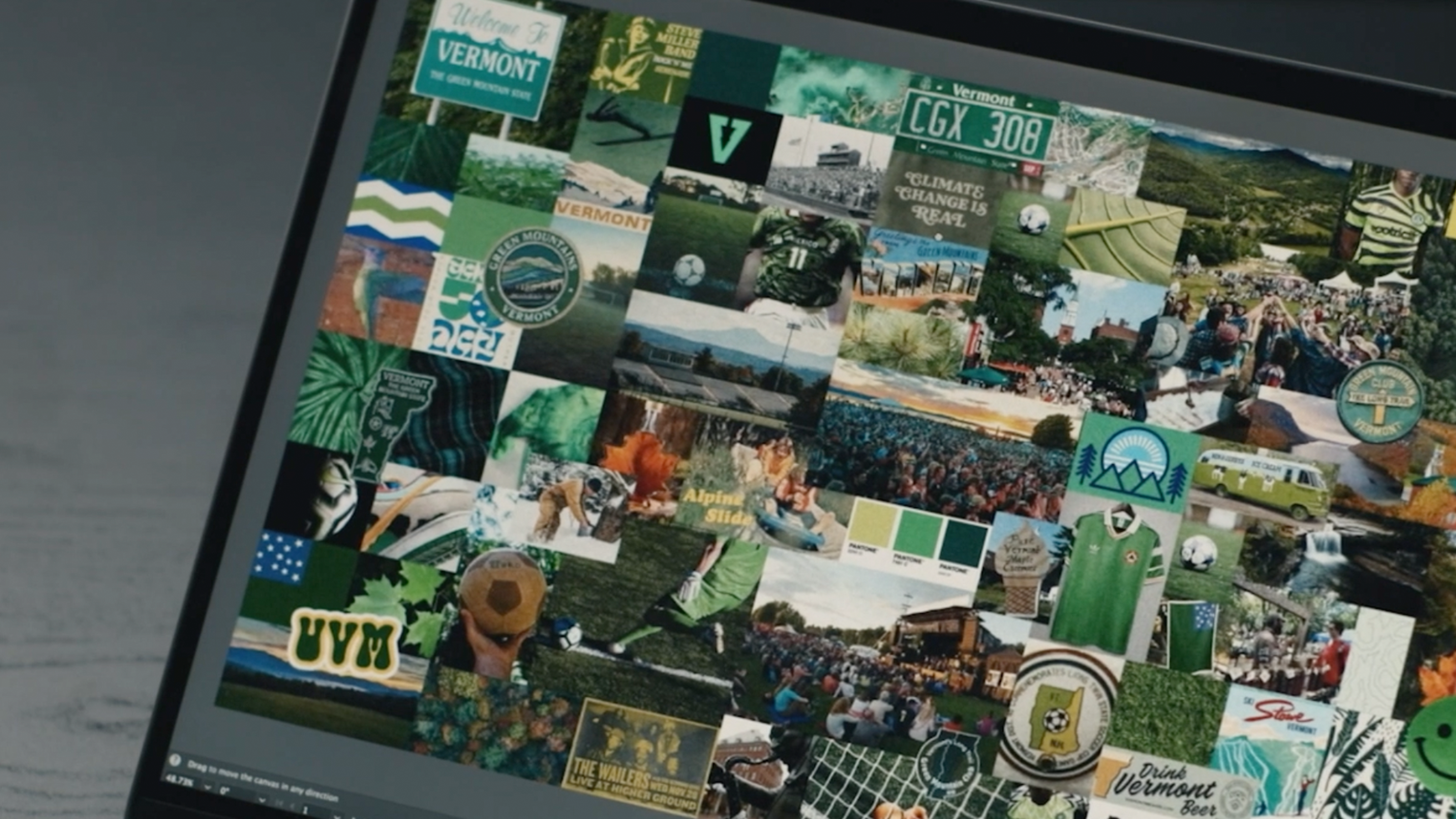
Because Vermont has a ton of natural beauty,
I knew right away that the crest would need to celebrate that.
I looked far and wide at inspiration and immersed myself in the culture.
It's the Green Mountain state, so of course I had to include a green mountain.
I played around a lot with how to pull through some of the joy that soccer brings fans or the optimistic nature of Vermont's residents.
This came through in the final version as a subtle smiley face,
but it took a lot of tinkering along the way.
Because this is the minor leagues, and I'm my own client here,
it was the perfect opportunity to get a little funky.
An MLS Club might not go for a smiling mountain,
but hey, I'm the one designing and approving, so why not?
I also made the decision to feature multiple shades of green in the crest because I knew we'd want to create all kinds of merch
and use as many shades as possible.
As you're designing, it's important to think about the applications of the work.
The fun of developing the identity spread into other brand elements.
Word marks, single color versions, secondary marks, and more.
Art inspires art.
We created the club intentionally to leave room for others to make it their own,
whether it's match day posters, TFOs, or even a homemade version of our mascot, Monte Vert, crafted by a diehard fan.
It's been awesome to see the work in the wild displayed on flags in front of homes or stickers across town.
To distill my process into a few easy steps,
it all comes down to inspiration, exploration, refinement, and application.
Inspiration,
the green of Vermont and the joy of soccer.
Exploration,
trying out different shades of green and ways of including a smiley face.
Refinement.
Now I've got my favorites and it's starting to take shape.
Application.
With a design finalized and its elements in harmony, it's time to feel out how it'll look in action.
So to wrap things up,
a good crest is the representation of the community, its history, its cultural elements.
These are the things that make people wear a crest with pride.
Oh, and it needs to look good, too.
Also, just know that crests and other visual branding for a soccer club will get feedback.
It'll be workshopped, but hang in there, communicate clearly, and stay true to your vision, and the crest will emerge even stronger.
You've got the crests covered.
Now let's move on to the creative work behind the kits,
featuring some of my work that's shown up on the pitch.

